Web designfor a Dental practice
A speculative homepage redesign for an independent East London dental practice. Same purple thread, sharper patient journey, real trust signals above the fold.
- Sector
- Dental, Healthcare
- Location
- East London
- Year
- 2026
- Timeline
- Three weeks
- Stack
- Next.js, Tailwind CSS, TypeScript, Figma
A practice with Plentyto say, on a page that wasn't saying it
This is an established dental practice in East London. More than a decade in the area, real reviews, a confident purple identity that already stands out in a sector painted clinical blue.
The homepage carried almost none of that. Three identical CTAs competed for the same click, no trust signals sat above the fold, and the page told a first-time visitor nothing about the team, the treatments, the pricing, or the next step. So I rebuilt it as a concept piece: same brand colour, same practice, a homepage that actually does its job.
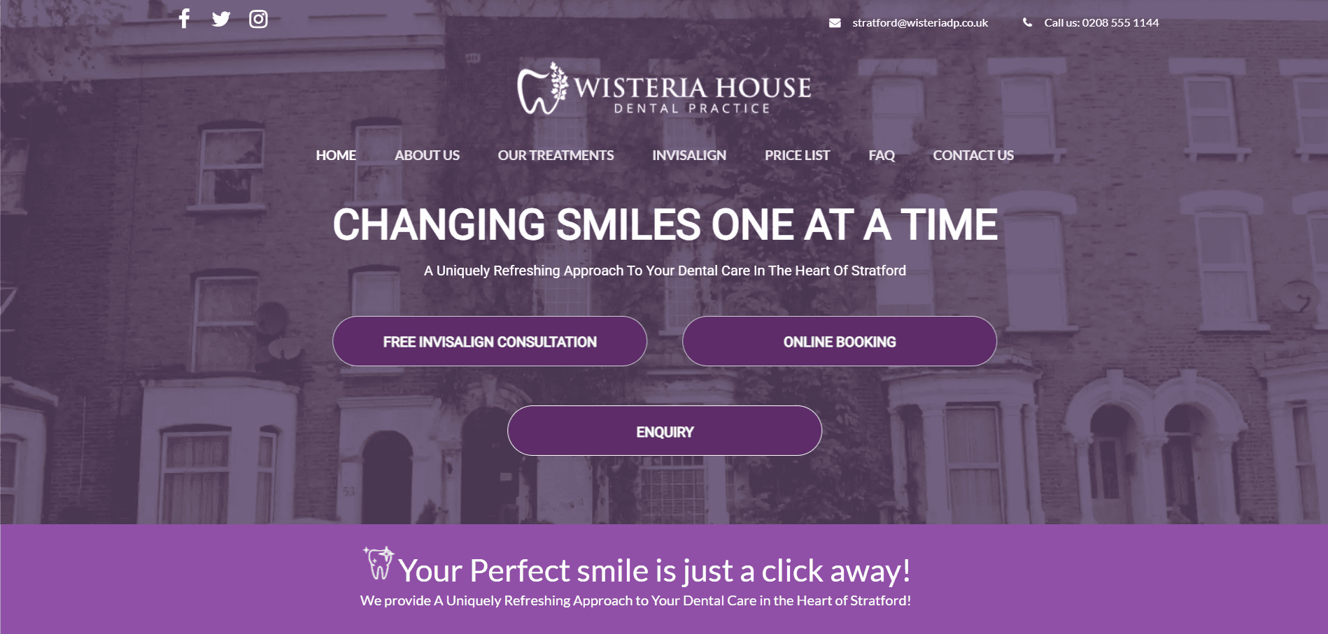
Three identical CTAs, no hierarchy
The hero showed Free Invisalign Consultation, Online Booking, and Enquiry side by side as visually identical purple pills. A patient cannot pick a next step when every step looks the same.
No trust signals above the fold
No Google rating, no team photo, no patient avatars, no testimonials. A first-time visitor had to take the practice on faith before they had anything to trust.
No contact form on the homepage
Enquiries lived behind a phone number and a separate contact page. The homepage made no attempt to capture a patient who was ready to ask a question.
A homepage built like a brochure cover
Hero photo, embedded map, Twitter and Instagram feeds in the footer, and that was the page. No treatments, no pricing, no FAQ, no story.
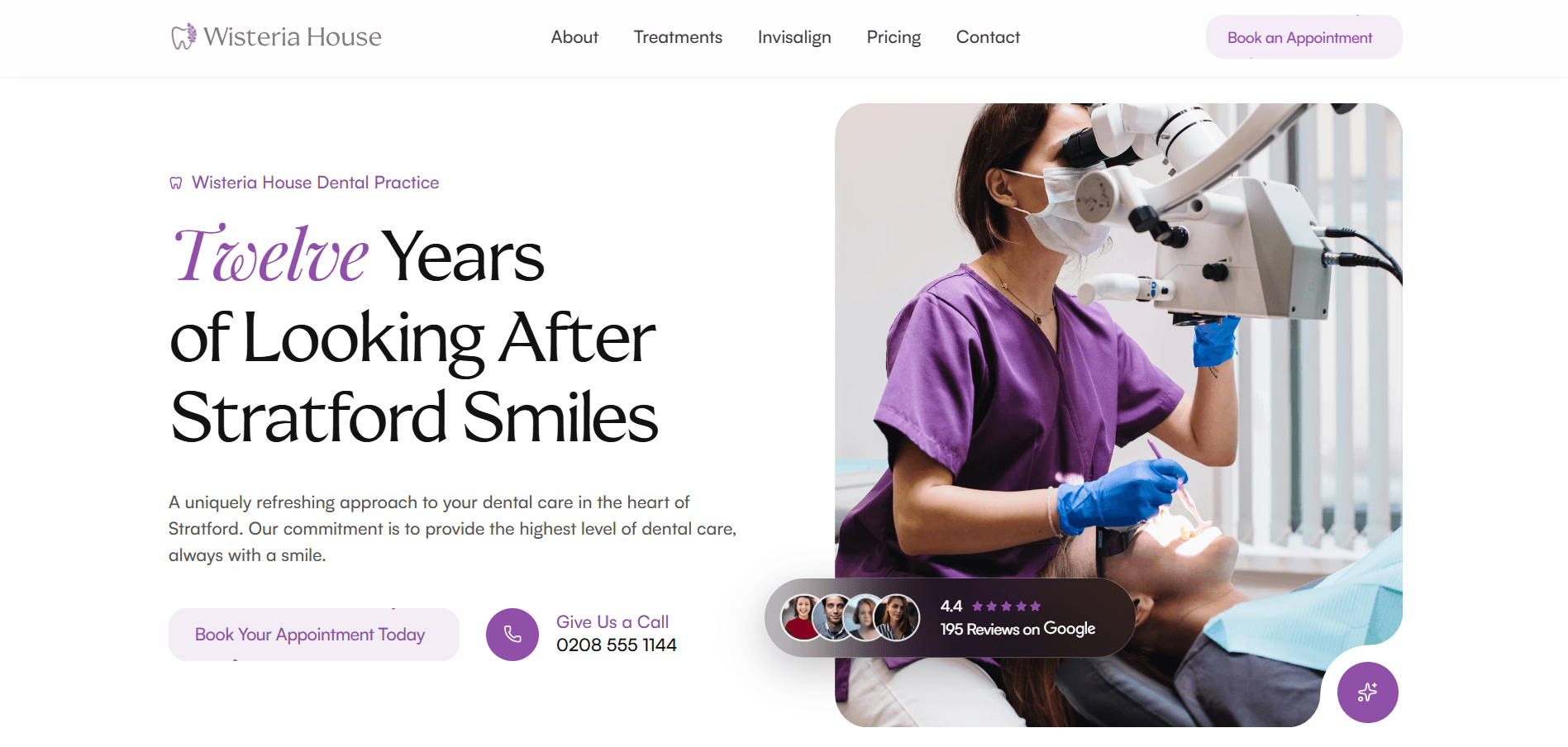
What the patient Seesin the first three seconds
A real face, doing real work
Replaced the muddy purple photo of a terraced street with a portrait of a clinician mid-treatment. Patients book people, not buildings.
Google rating and patient avatars, above the fold
Pulled the Google star rating and review count up to the hero alongside an avatar cluster. The first trust signal is now the first thing a visitor sees.
One primary CTA, one secondary, no equals
Book Your Appointment Today as the single primary action. The phone number sits as the secondary path. Every other route moves deeper into the page.
Editorial typography with a real voice
Swapped the all-caps slab headline for a softer serif display face plus a script accent on the word that matters. Friendly, considered, miles away from the blue-clinical default.
Light surface, breathable composition
Cream surfaces instead of an oppressive dark photo overlay. The hero now reads as a calm, welcoming room rather than a heavy one.
Sticky shortcuts, never a dead end
A persistent floating action keeps booking one tap away no matter how far down the page the patient has scrolled.
What stayed and whatChanged
- ColourSame purple, more breathing room(01)
- TypeEditorial faces over generic sans(02)
- TrustProof at every scroll depth(03)
- MotionMicrointeractions that earn attention(04)
From a three-section Brochureto a full patient journey
The old homepage shipped with three sections: hero, embedded map, footer. The redesign sits at nine, each chosen to answer a specific question a first-time patient has before they book.
- Hero with trust signals
- Over a decade of practice
- Treatments at a glance
- First visit walkthrough
- Team and technology
- Patient testimonials
- Pricing and finance options
- Plain-answer FAQ
- Contact form on the page
For comparison, the original homepage in full. Three sections from top to bottom: hero, embedded map, footer.
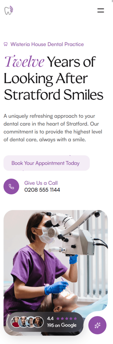
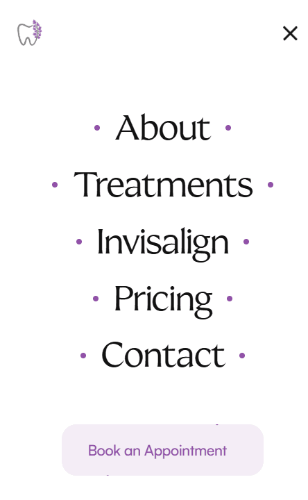
Composition holds at every viewport
Mobile keeps the same composition: trust signals above the fold, single primary CTA, soft surface, friendly typography. The menu opens onto a light frost panel with serif type, in the same brand voice as the desktop page.

A homepage built to Dowhat the old one didn't
This is a concept, not a live engagement, so the numbers a real shipped site would chase are aspirational here.
The goals below are what the redesign was built to make possible if it shipped: faster trust, a clearer next step, and a brand that holds its line.
Reduce time-to-trust to a single screen
Google rating, real photography, and a clear primary CTA all sit above the fold on every viewport.
Make booking the obvious next step
One primary action, repeated as a sticky shortcut, and reinforced by an on-page contact form below the hero.
Answer the questions before patients ask them
A pricing tier, an FAQ, a first-visit walkthrough, and a treatments overview, all on the same page.
Stay distinctive in a blue sector
The brand purple is treated as the asset it is, and the typography and layout reinforce that distinction.
See the redesign live
Try the redesigned homepage in your browser, then compare it to the current site.
Start yourProject today
Let's work together
How do we connect?
- Get a reply within 24 hours
- Direct access to your specialist, no bots.
- We ask smart questions fast.