Best Law Firm Websites in the UK, 10 Solicitor Websites Worth Learning From
I've picked ten UK law firm websites that small and medium-sized practices can take ideas from. I've looked past the attractive homepages and gone through their menus, service pages, solicitor profiles, fees and enquiry forms, with annotated screenshots showing what I like and what I'd change.

What makes these solicitor websites worth looking at?
- You don't need a large firm's website to find useful ideas. Some of my favourite examples here come from very small practices, including a sole practitioner.
- Complete Clarity Solicitors uses everyday language in its menu, including the heading “How We Can Help You”.
- Compass Immigration Law puts practical visa information on the service page itself, so people don't have to look for it elsewhere.
- Family Law Partners makes it easy to contact an individual solicitor and explains why its enquiry form asks for sensitive information.
- Roche Legal, Lawtons and Monaco Solicitors tell people what to expect after making an enquiry.
Why I've chosen these ten websites
Search for the best law firm websites and you'll usually find the same kind of list, a collection of impressive homepages from big national and international firms. They're interesting to look at, but I'm not sure how useful they are to a practice with three or four solicitors and a much smaller budget.
I wanted to put together something more practical. I design and build websites for law firms, so I looked at the things I'd pay attention to when planning one. Those are whether the menu makes sense, how a firm explains its services, what its solicitor profiles tell you, how clearly it deals with fees and how easy it is to get in touch.
None of the firms featured here are my clients. I'm using screenshots of their websites to explain what I think works and, in a few places, what I'd do differently. The letters on each screenshot match the notes underneath. I've also included the page addresses so you can look at the original examples.
How I chose them
I looked through more than 100 UK law firm websites before narrowing the list down. I wanted examples from firms of different sizes, but I kept the focus on small and medium practices. The smallest is a sole practitioner; the largest are regional firms with several offices.
I looked beyond each homepage and checked how the sites worked on a phone as well as a laptop. I also ruled out ideas that would be difficult for a smaller firm to afford, such as expensive video production or bespoke illustration.
Most importantly, I've stuck to things you can see in the screenshots. I don't know how many enquiries these firms receive or how well their websites convert, so I'm not going to pretend I do. These are my observations about the design, content and usability.
All screenshots were taken in October 2026. The websites may have changed since then.
Law firm website navigation, three very different approaches
A menu might seem like a small part of a website, but it decides how easily someone can find the help they need. I particularly like these three examples because they show how the right approach changes depending on the size and services of the firm.
Mason Bullock Solicitors, keeping things simple
Mason Bullock is a Coventry practice run by a sole solicitor who advises employees on settlement agreements. There is only one main service to explain, so the website doesn't try to look like the site of a much larger firm.
The main navigation has four links. I think that's a good reminder that a small firm doesn't need a long list of pages because other law firms have one.

Marker A. Four straightforward linksHome, About Us, Prices and FAQs. Someone can see exactly what's on the site without having to open several menus.
Marker B. A more useful call-to-action“Get Your Free Consultation” tells you what you're being offered. “Contact Us” would be less specific.
Marker C. The phone number is hard to missIt's one of the most prominent things in the header, which makes sense for anyone who would rather ring than fill in a form.
The rest of the first screen follows the same approach. It explains the service, says who it's for, introduces the solicitor and offers a free initial call. There's no unnecessary complication.
I'd make a couple of small changes. The image of a woman using a laptop feels generic, particularly when a photo of the solicitor would be more personal. I also noticed that the menu breaks onto a second line at some laptop widths. Neither is a major problem, but both would be worth fixing.
Complete Clarity Solicitors, using the client's own language
Complete Clarity Solicitors is based in Glasgow and covers disputes, family law, business matters and property. What I like here is that the homepage doesn't assume a visitor knows which legal department they need.
Instead, it presents four situations people might recognise, such as needing to resolve a dispute or having a family issue. You can choose the one that sounds most like your problem and go from there.
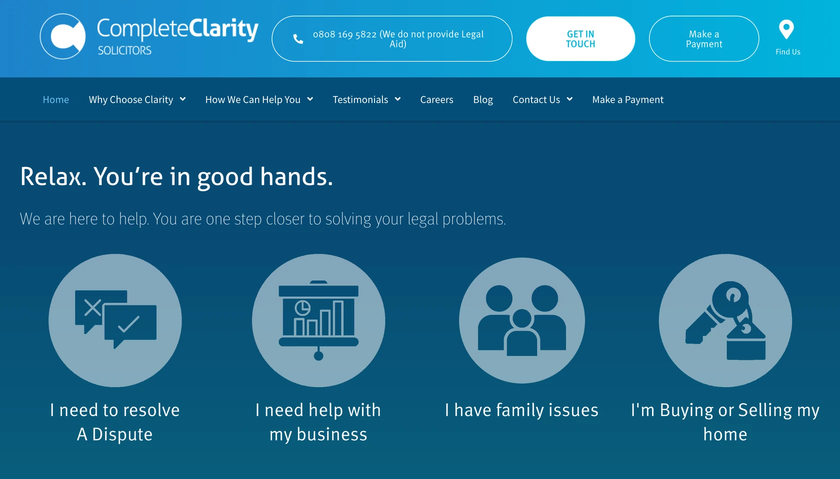
Marker A. Useful information beside the phone numberThe header makes it clear that the firm doesn't provide Legal Aid. That's something a potential client needs to know before calling.
Marker B. Two different actions for two different peopleNew clients can use “Get in Touch”, while existing clients have a separate “Make a Payment” option.
Marker C. A better name for the services menuThey call it “How We Can Help You” rather than “Practice Areas”. It's a small change, but it sounds much more like something a client would understand.
Marker D. Four choices based on real situationsThe homepage uses statements such as “I need to resolve a dispute” and “I have family issues” instead of making people work out the legal terminology.
That language carries through into the menu itself, where several links begin with “I need”. It's consistent without feeling complicated.
I also checked the mobile version, because these kinds of choices can become difficult to use when they have to fit on a smaller screen. Here, they work quite well.
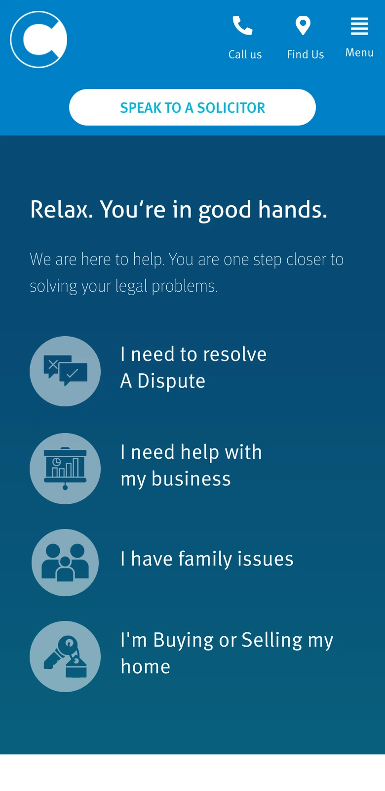
Marker A. The icons have labelsCall Us, Find Us and Menu are written underneath their icons. You don't have to guess what each symbol means.
Marker B. The enquiry button is near the top“Speak to a Solicitor” appears just below the logo, so it's easy to find.
Marker C. The four choices stack neatlyInstead of trying to fit four tiles across a phone screen, the site turns them into large, easy-to-tap rows.
One thing I'd change is the floating reviews badge. On a shorter laptop screen, it partly covers the first of the four options until you scroll. The reviews are useful, but they shouldn't get in the way of the page itself.
Pinney Talfourd, helping people find the right service
Pinney Talfourd is a larger regional firm in Essex, with several offices and services for both individuals and businesses. It needs a different kind of menu from Mason Bullock. There's more information to organise.
I like the way the homepage splits the two audiences before asking them to pick a service. It's much easier than presenting everyone with one very long dropdown.
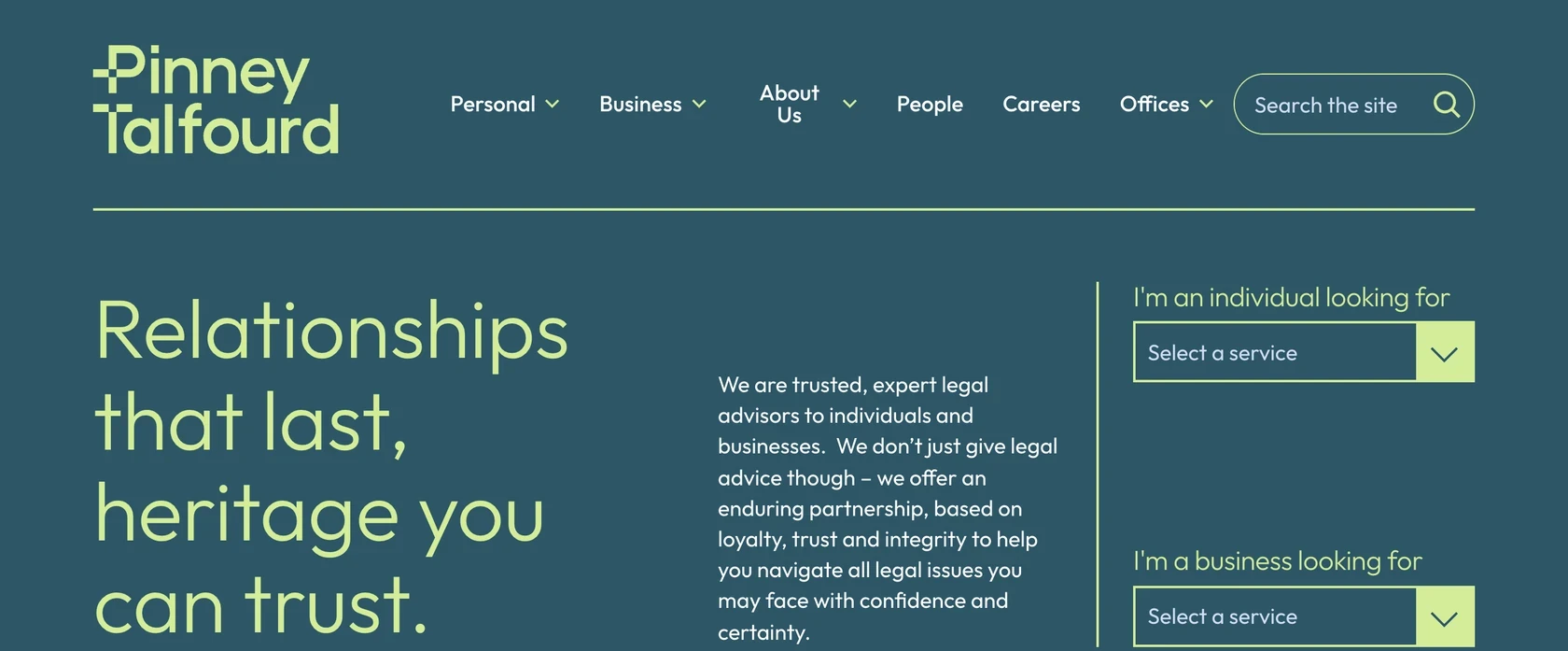
Marker A. Personal and Business are the first choicesA homeowner and a business owner can go straight to the part of the website that's relevant to them.
Marker B. A service finder on the homepageIndividual clients can select what they need without opening the navigation at all.
Marker C. A separate finder for business clientsKeeping these services apart makes both lists easier to scan.
Marker D. Search is available in the headerThat's useful if someone already knows a solicitor's name or is looking for something specific.
I'm less convinced by the main headline. It doesn't immediately say what the firm does or where it's based, which I'd usually want to see near the top of a law firm's homepage. The service finders do help to make up for that.
It's worth taking a look at the firm's solicitor profiles too. The one I read included a direct phone number, a mobile number, an email link and a short section called “On a personal note”. Those are the kinds of details that make a profile feel more useful than a formal biography.
Service pages that answer what clients want to know
When someone opens a page about divorce, conveyancing or a visa application, they're usually looking for quite specific information. What does the process involve? How long could it take? Who will deal with it? What might it cost?
I found plenty of law firm websites that spent most of their service pages talking about the firm's experience. The next two examples are better at getting to the information someone has come for.
Compass Immigration Law, practical information in one place
Compass Immigration Law is a small practice in Bolton. Its partner and spouse visa page is one of the most useful service pages I came across, largely because it answers so many questions without making you visit three or four other pages.
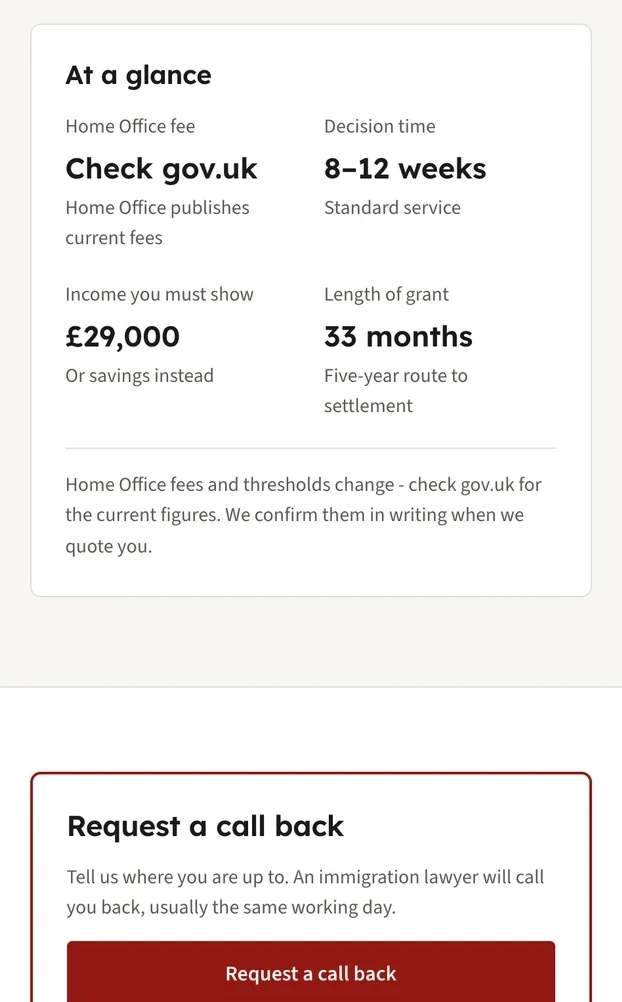
Marker A. Important information at a glanceThe box near the top brings together the expected decision time, income requirement and visa length. It directs readers to GOV.UK for the latest Home Office fees and explains that the rules and figures can change.
Marker B. An explanation of what happens after an enquiryThe callback box says that an immigration lawyer will usually ring on the same working day. It's helpful to know that before sending your details.
There are quite a few other things I like about this page. The phone number comes with the hours when it's answered. The page names both its writer and reviewing solicitor, along with a review date. Then it goes through eligibility, documents, how the firm handles an application and answers to common questions.
Evolve Family Law, clear fees and real people
Evolve Family Law specialises in family law, with offices in Manchester and Cheshire. On its divorce page, the firm describes the service and introduces the solicitors who might be working on your matter, with photos, names and links to their profiles.
The text above the team explains that clients work with a named solicitor throughout and receive that person's direct mobile number. I think that's a reassuring detail, especially for work as personal as family law.
The firm's pricing page is worth studying separately. Family law isn't one of the areas covered by the SRA's mandatory pricing list, but Evolve has chosen to publish a detailed list anyway. “Our Prices” is also easy to find in the main menu.
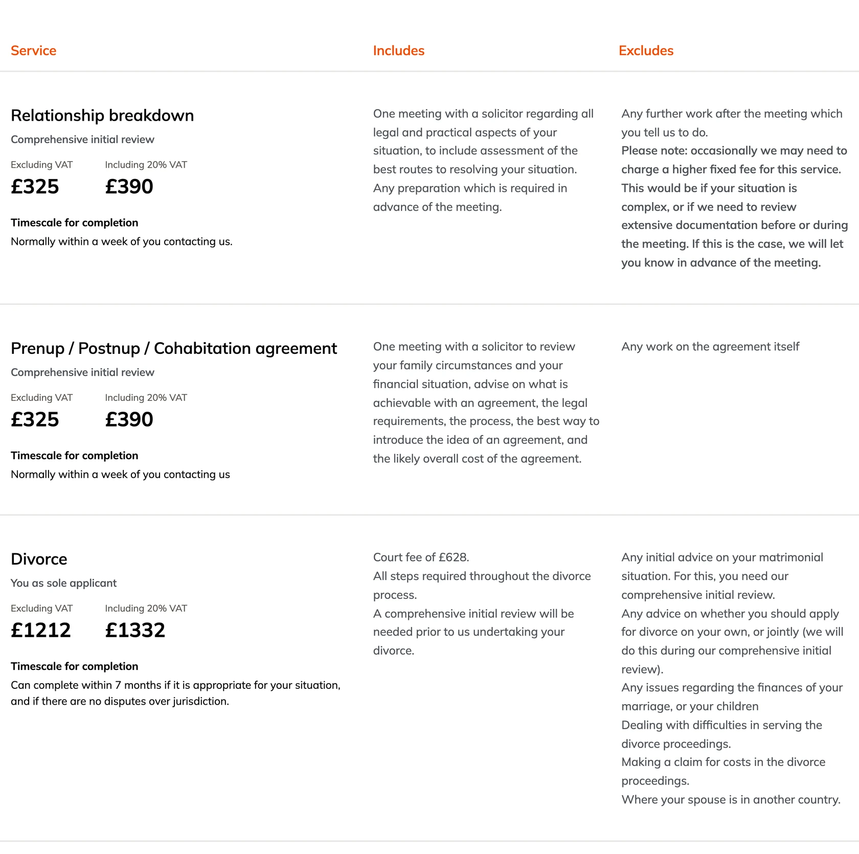
Marker A. Clear headings for each part of the feeThe table tells you what the service is, what's included and, importantly, what isn't.
Marker B. Prices are shown with and without VATFor a private client, the total including VAT is usually the figure they really want to know.
Marker C. Timescales appear alongside the pricesYou can see how long a service is expected to take without searching for that information elsewhere.
Marker D. The exceptions are explainedThe firm says when an additional fee might apply and that it will discuss the change in advance.
Marker E. Court fees aren't hiddenThe divorce entry makes clear that the court fee is included and gives its amount.
Further down, the page includes individual lawyers' hourly rates and the types of work they take on. It is a long page, though, and I'd add a few links at the top to help people jump to the section they need.
Solicitor profiles, helping someone choose who to contact
A law firm website needs to give people confidence in the firm, but often they're also trying to decide whether they feel comfortable speaking to a particular person. That's why I think individual solicitor profiles deserve more attention than they sometimes get.
Family Law Partners, useful details beyond the biography
Family Law Partners has offices in Brighton, London and several other towns in the South East. I particularly like the consistency of its team profiles. They're a good example of how a law firm can make each solicitor's page helpful to a client and more than a CV.
I haven't included a screenshot of an individual profile, but I'd encourage you to look at the firm's team page and open one. These are the details I noticed:
- A direct phone number, email link and social profile link appear near the solicitor's name, before the biography.
- The photographs feel personal and are taken outside the office rather than against an anonymous studio background.
- Testimonials mention individual solicitors by name, so you're reading about someone's experience with that person rather than the firm generally.
- Articles written by the solicitor give you a sense of their knowledge and the way they explain things.
- The solicitor's SRA number links to their entry on the regulator's register, where a visitor can check their details.
The contact page is also worth looking at. It lists the offices with their contact details and parking information, but the part I want to show is the form.
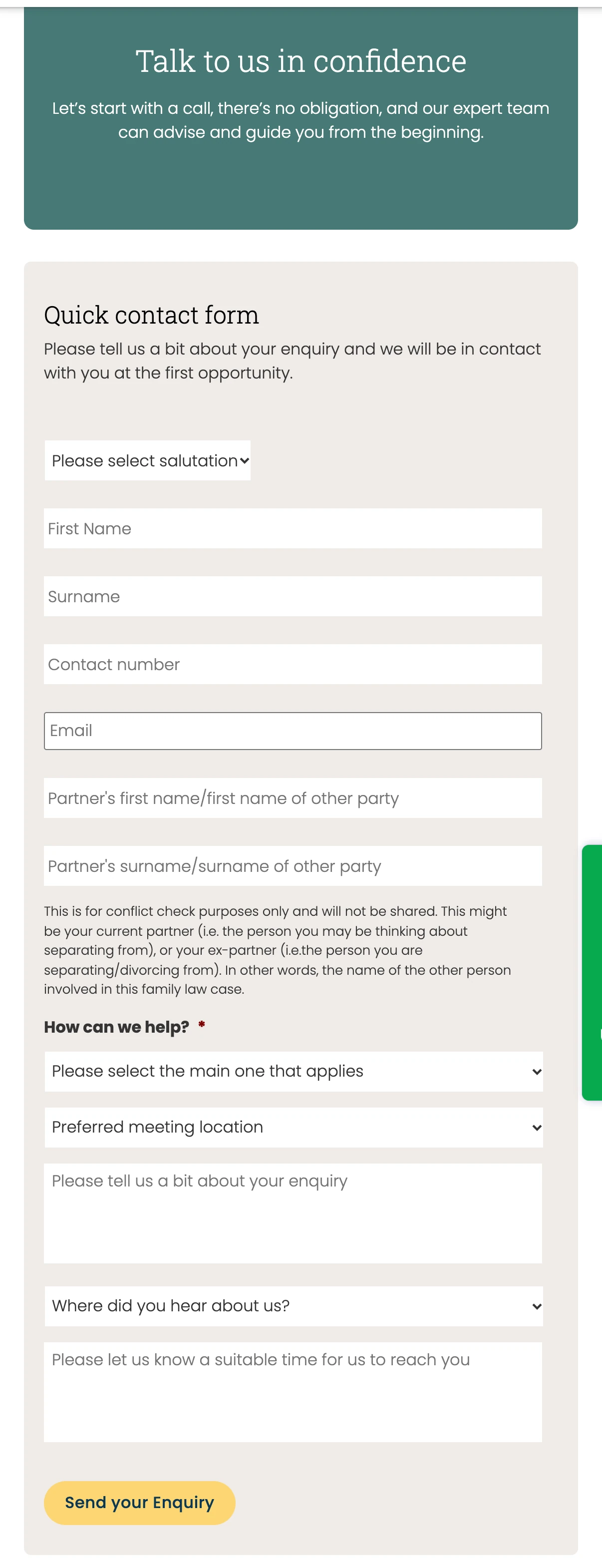
Marker A. A reassuring introduction“Talk to us in confidence” appears above the form, with an explanation that making an enquiry doesn't create an obligation.
Marker B. The form explains a sensitive questionIt asks for the other person's name because the firm needs to check for a conflict of interest. The accompanying note explains that this is the only reason for collecting it and that it won't be shared.
Marker C. You can choose the kind of help you needA list of legal matters makes the question easier to answer and helps the firm direct an enquiry to the right person.
Marker D. It asks when it's convenient to callIn a family matter, someone may not want a solicitor calling while other people are at home. I like that the form takes this into account.
The form is on the long side, and only one question is clearly marked as required. I'd make the optional fields more obvious. But the explanation beside the conflict check is excellent. More law firms could do this whenever they need to ask for information that might make someone hesitate.
Getting in touch, four websites with good ideas
The contact page is important, but it isn't always the only way someone reaches out. Depending on the service, they might prefer to ring, ask for a callback, complete a short assessment or get an instant quote.
These four websites show different ways to make that first conversation easier.
Lawtons Solicitors, making urgent help easy to find
Lawtons specialises in criminal defence, with offices in London and surrounding areas. Someone visiting the site may have been arrested, have a court date coming up or need advice urgently. The homepage seems to have been planned with that in mind.
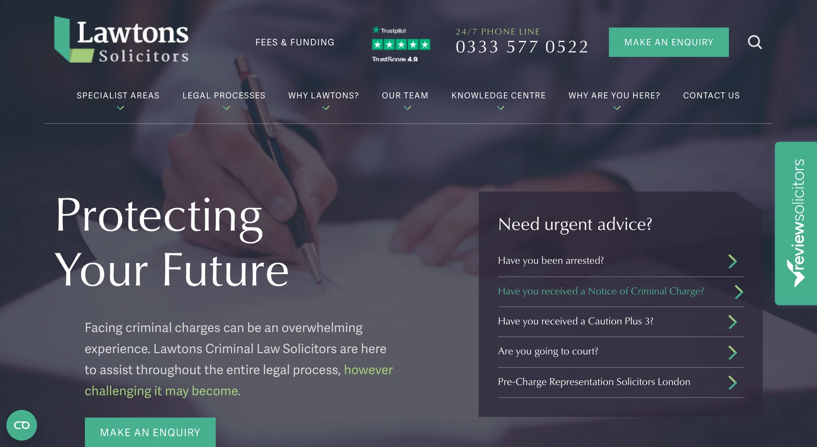
Marker A. Links based on what has happened to youQuestions such as “Have you been arrested?” and “Are you going to court?” take people straight to relevant information.
Marker B. The phone number and availability are clearThe header identifies the line as being answered around the clock. For urgent criminal defence work, that's useful information to have immediately.
Marker C. Fees and funding are easy to findThe link is in the header, where someone worried about costs can see it.
Marker D. The menu talks about situations as well as services“Why are you here?” leads to choices such as “I've been accused of” and “I've been charged with”. You don't need to know the precise legal term to get started.
At the bottom of the homepage, the firm makes another useful point, which is how quickly it expects to respond to enquiries.
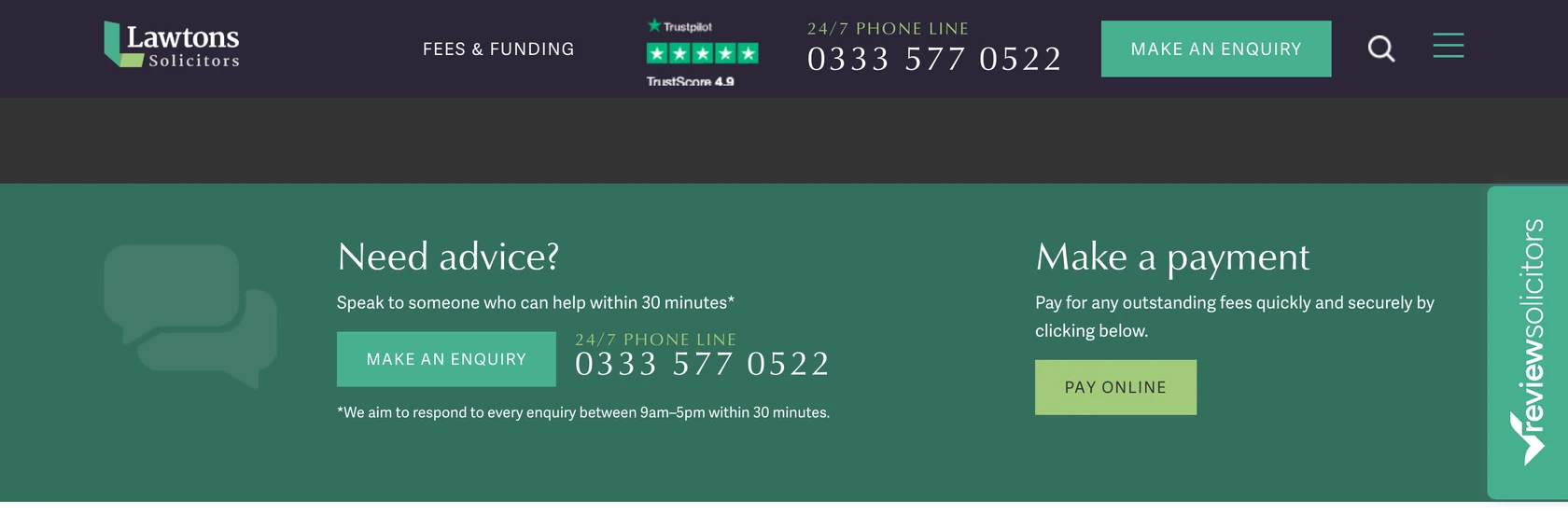
Marker A. You can still get in touchThe header stays visible as you scroll, including the phone number and enquiry button.
Marker B. The response time is specificThe page says you can speak to someone who can help within 30 minutes.
Marker C. It explains when that promise appliesThe smaller text gives the relevant hours. I'd always rather see an honest limit than a vague promise.
Marker D. Existing clients have their own routeA separate payment option means people settling bills don't have to go through the new enquiry form.
Roche Legal, explaining what happens after you make contact
Roche Legal is a York firm that works on wills, probate and estates. One of my favourite sections on its homepage is also one of the simplest. It explains what happens after you contact the firm.
This is easy to overlook when you're writing a website, because the people working at the firm already know the process. A first-time client probably doesn't.
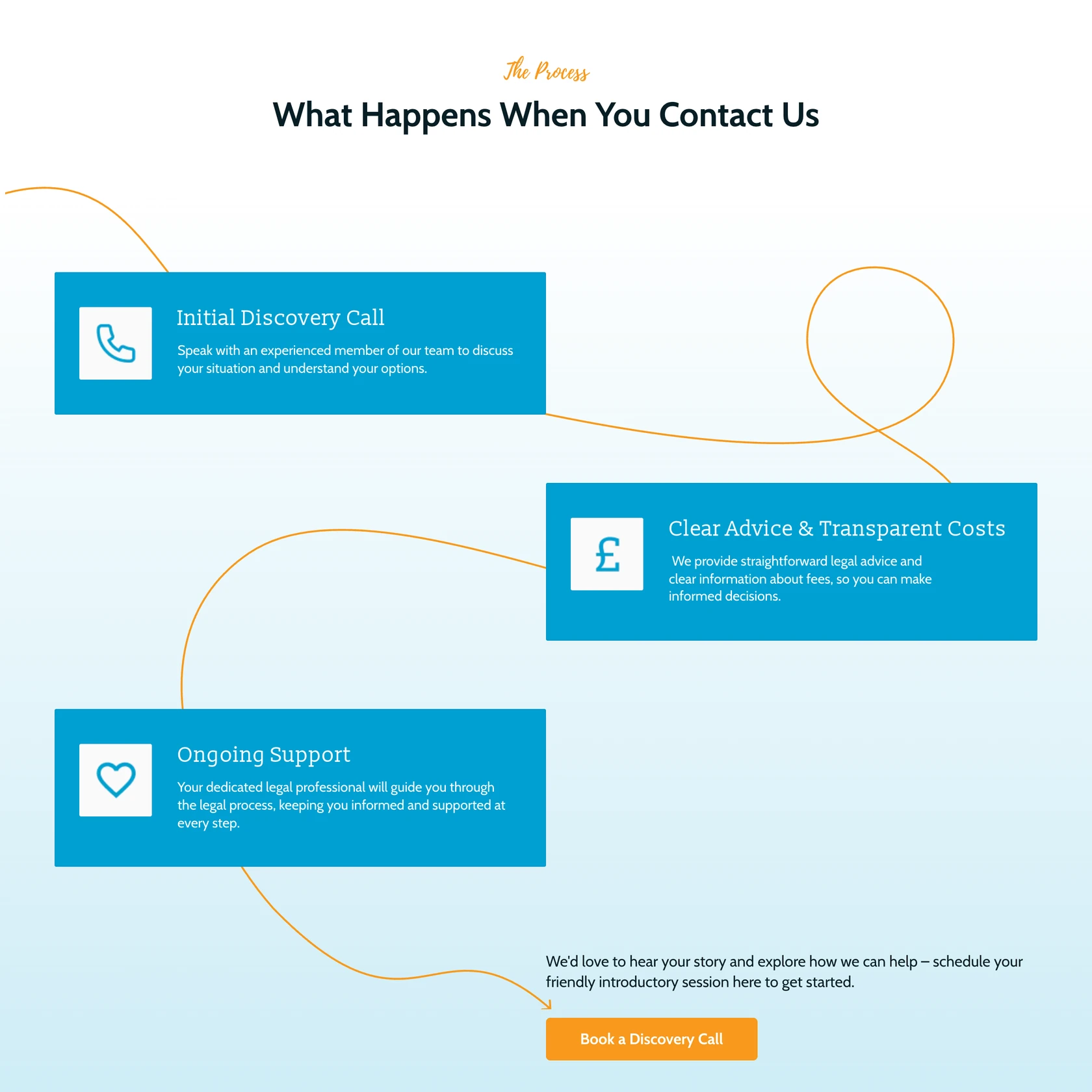
Marker A. A heading that gets straight to the point“What Happens When You Contact Us” is exactly the question the section answers.
Marker B. The first step is explainedThe visitor is told they'll speak to an experienced member of the team about their situation and options.
Marker C. Fees have their own stepThe process makes it clear that costs will be discussed. There's also an “Our Charges” page in the main menu.
Marker D. The button matches the explanation“Book a Discovery Call” refers back to the first step, so you know what you're booking.
“Discovery call” isn't a term everyone will be familiar with, but Roche explains what the call involves before asking anyone to book one. There's also a question about it in the homepage FAQs. For me, that's what makes this section effective. It takes something the firm knows very well and explains it to someone who doesn't.
Monaco Solicitors, asking the right questions in the form
Monaco Solicitors is a London employment law firm that represents employees. Its contact form goes a little further than the usual name, email and message fields, and I think it makes sense for the work they do.
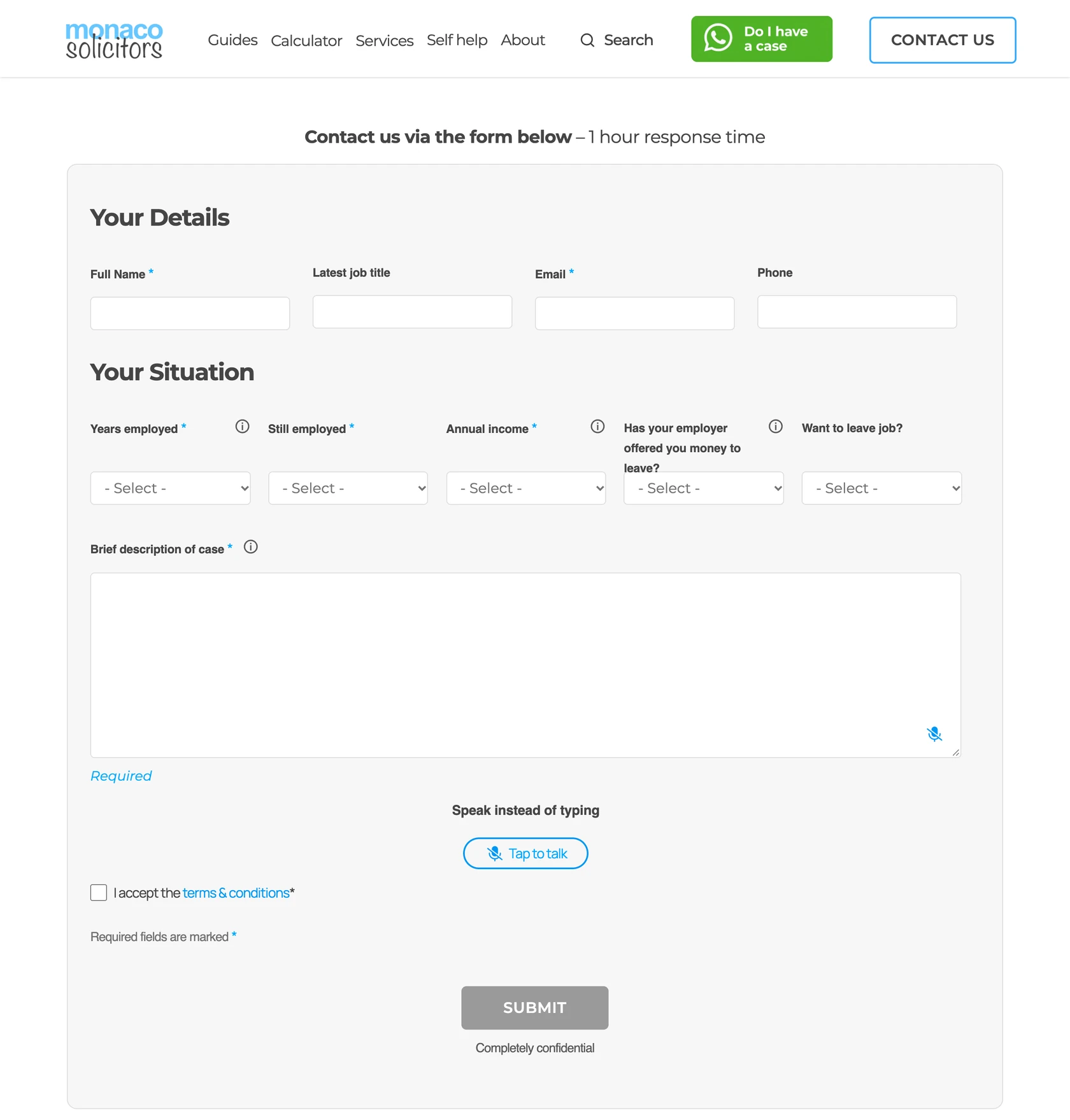
Marker A. You know when to expect a replyAbove the form, the website says it responds within one hour.
Marker B. The questions relate to the caseIt asks how long the person has worked for their employer, whether they're still employed, their income and whether an offer has been made. Most of these answers can be selected rather than typed out.
Marker C. You can dictate your messageThere's a speech-to-text option for people who would rather talk than write a long description, particularly on a phone.
Marker D. A short confidentiality reminder“Completely confidential” appears below the submit button. That's relevant when someone's sharing details about their employer.
Marker E. Another option for people who aren't sureA button in the header offers a free assessment rather than taking everyone straight to the contact form.
The homepage also explains what happens once the firm receives an enquiry, using a simple diagram.
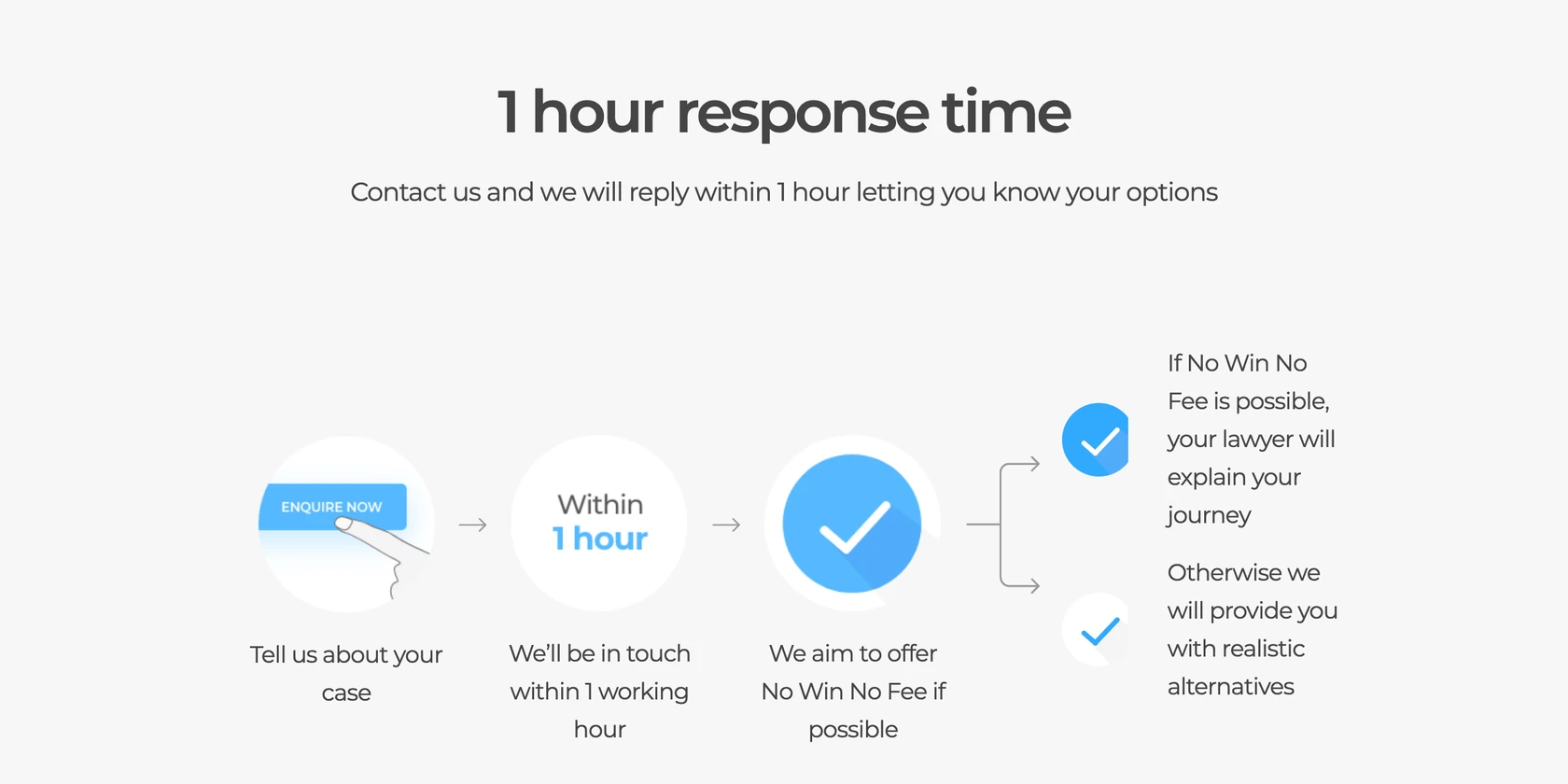
Marker A. The response time stands out“1 hour response time” is the main heading, followed by a short explanation of what the reply will cover.
Marker B. The process is broken into three stepsYou explain your situation, the firm gets back to you within a working hour, then it explains the available funding options.
Marker C. It covers both possible outcomesIf no win no fee is available, the firm explains the next steps. If it isn't, it says it will discuss other options.
I particularly like that last detail. The page describes the outcome someone hopes for, and it also tells them what happens if the case can't be taken on a no win no fee basis.
The site also has a settlement agreement calculator and a collection of guides. Both give people something useful to look at before they're ready to speak to a solicitor.
Bird & Co Solicitors, getting a conveyancing quote without calling
Bird & Co is a high street firm with offices in Grantham, Lincoln and Newark. Conveyancing is a service where people often want to compare prices before making a decision, so having an instant quote tool is a sensible choice.
There's a link to it in the header throughout the site. When you open it, you get a separate screen with very little else to distract you.
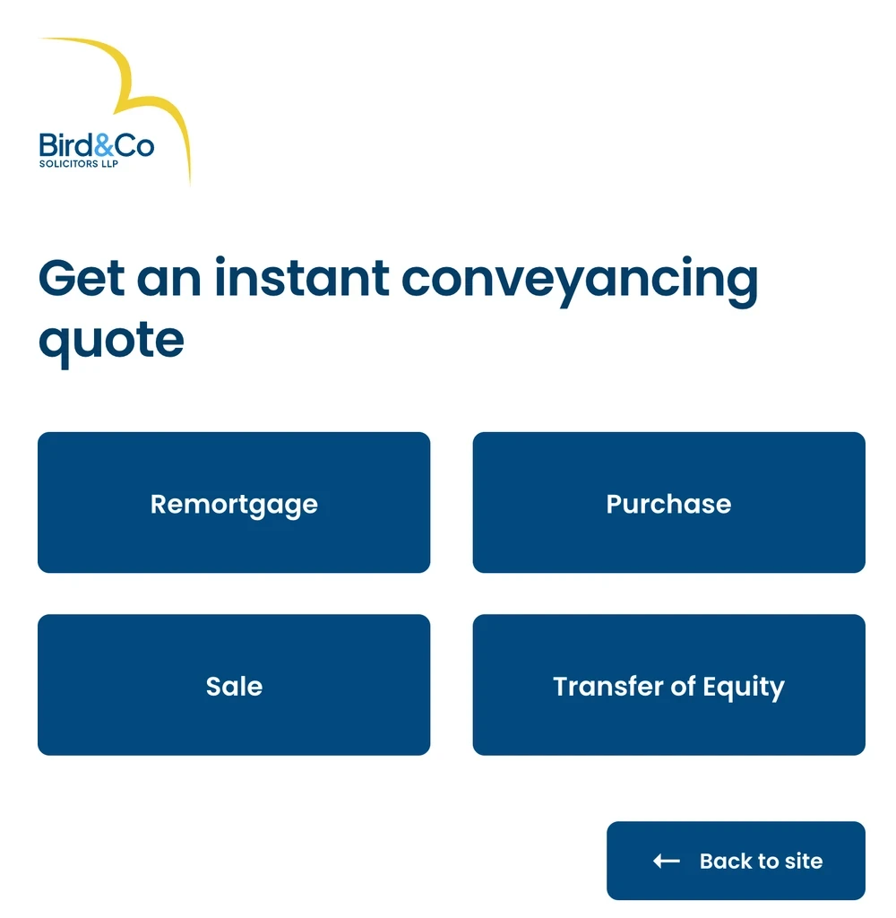
Marker A. The page focuses on one thingThe usual website navigation disappears, so the quote tool is the only thing on the screen.
Marker B. Starting is easyThe first choice is a button for Remortgage, Purchase, Sale or Transfer of Equity. You're not immediately faced with a long form.
Marker C. There's an obvious way backA “Back to site” button remains visible if you decide you want to browse first.
The quote screen also includes the firm's review score and a recent review, which is useful at the point when someone is comparing options.
On mobile, Bird & Co keeps Phone, Enquiry and Menu in a bar at the bottom of the screen. I like that those options remain easy to reach even when you're halfway down a page.
What the best law firm websites have in common
These firms do very different types of work, but I noticed a few things coming up repeatedly as I went through their websites.
- You can usually find a phone number straight away, often with an indication of when someone will answer.
- Menus use words a potential client is likely to understand.
- Fees, or at least an explanation of how the firm charges, are easy to find.
- Service pages introduce the people who will do the work.
- The contact process is explained, including when someone should expect a reply.
- The main information and contact options are still accessible on a phone.
A lot of these improvements don't require a new website. Making a phone number more visible or explaining what happens after someone submits a form can be a fairly small change. And it's worth getting these basics right, because people coming from Google, a referral or an advert all end up using the website to find out more about the firm.
What I'd change first on a small law firm's website
If you're planning a redesign, it's tempting to start with colours, fonts and the homepage layout. I'd look at the practical things first. They can make a difference to how easy the site is to use, and several can be done without a redesign at all.
I've also written about the information law firm websites must display under the SRA rules and how to keep your Google rankings during a redesign, if you're thinking about making larger changes.
Law firm website examples, common questions
Which law firm has the best website in the UK?
I wouldn't pick one overall winner. A criminal defence website has a very different job from a family law or conveyancing website. If you're running a small practice, you're better off looking at firms with a similar number of people and similar services.
What should a solicitor's website include?
At a minimum, I'd want clear navigation, a useful page for each main service, solicitor profiles with contact information, an explanation of fees and an easy way to make an enquiry. People should also be able to find your contact details without searching around.
SRA-regulated firms have additional requirements, including displaying their SRA number and digital badge and publishing information about their complaints procedure. It's worth checking the full rules when building or updating the site.
Do law firms have to show prices on their websites?
For certain services, yes. The SRA Transparency Rules require firms to publish price information for services including residential conveyancing, uncontested probate, some immigration applications and unfair or wrongful dismissal claims at employment tribunals.
How many pages does a small law firm website need?
It depends on how much work the firm does. A sole practitioner offering one main service may only need a handful of pages.
If you offer several services, I would generally give each important one its own page so people can find the information they need. You'll also want solicitor profiles, contact details and the relevant pricing and regulatory information.
Can I copy ideas from another law firm's website?
You can certainly use another firm's website for inspiration. Maybe you like the way it organises services, the wording of its contact process or the way it explains fees.
What you shouldn't do is take its text, photography or design and reproduce them as your own. If you're working with a designer, it's much more helpful to point out the parts you like and explain why they appeal to you.
How much does a law firm website cost in the UK?
That depends on the size of the site, how much content needs writing, whether you need new photography and whether it includes features such as a quote calculator or online booking.
I've covered typical price ranges in my guide to website costs in the UK. For an individual law firm project, I prefer to have a conversation about what the website needs to do before putting together a written quote.
Using these examples for your own law firm website
If you're thinking about updating your firm's website, I'd start by choosing two or three examples from law firm websites you like or even dislike, because that provides direction. Look for the particular things that would or would not work for your own clients.
You might want a service page as thorough as one of the examples, fees explained as clearly as another one’s and solicitor profiles with the personal details shown by a different law firm’s website. That's a much more useful starting point for a website brief than asking for something modern and professional.
I run Proxima Studio and work on website design and development for law firms. If you'd like me to look through your current site and talk about what could work better, you can read more about my web design for law firms or book a call. I also have information about law firm web design in London and solicitor web design in Essex.